I've always been a bit picky about fonts in books, the web, programming, etc. I want something that is easy to read and tell characters apart. While some developers choose fonts that are very light so they can get more characters in a line or screen, I go with readability and want my programming fonts bolder. It's a reason that I searched for a long time and chose IBM Plex Mono as my chosen programming font. Every once in a while I look at other fonts but always come back to Plex Mono. There is even a game about choosing a coding font and Plex Mono wins out for me. It's even open source – download it from Github.
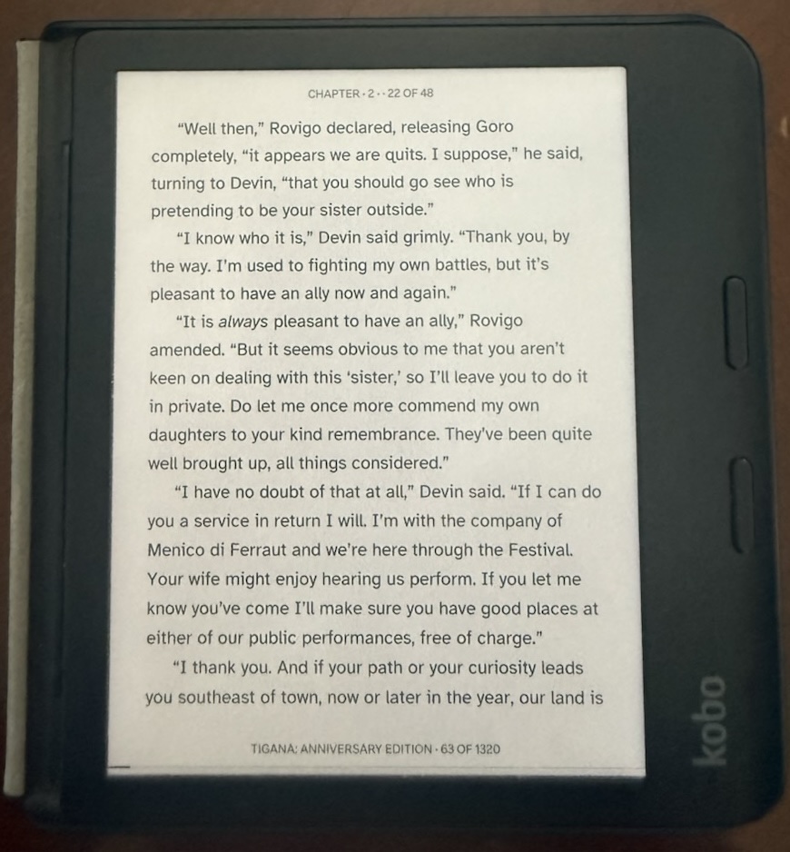
This journey with programming fonts was great but I was struggling with my reading font and it was harder to make a good choice. You see, I read a ton on my Kobo Libra Color and I really enjoy it but have noted that long reading sessions fatigued my eyes. I messed with different built-in fonts but nothing ever really worked. Even increasing the font size a bit didn't really help, or it was so big it was annoying. Someone in a Reddit post posted a link to the Atkinson Hyperlegible font from the Braille Institute. I figured if people that help people who can't see or can't see well made a font to be hyperlegible, it must be good. So I downloaded it (I had to give them my email address but no money) and installed it on my Kobo (not hard but you do need to understand folders, etc). Honestly it took me a bit – I usually preferred more of a serif font to read but as I got used to it, I really found it to be, well, hyperlegible! I even toned down the size a bit and still like it. I would highly recommend giving it a shot!